In the first part of this series we covered the context of this exploration of data, then showed how to extract the replies of a tweet from Twitter.
This post will cover how to extract sentiment from the tweet text using Python. After extracting the sentiment, we'll have a brief look at it before proposing next steps.
Extracting sentiment from text using Python
TextBlob is a great library for natural language processing (NLP) in Python. We'll use it to extract the sentiment from the text.
First, install it: pip install textblob
Recall from the first part in this series that we have a list stored_tweets, in which each element is the text of the tweet.
We can extract the polarity of the tweets as follows:
from textblob import TextBlob

polarities = [TextBlob(tweet).sentiment.polarity for tweet in stored_tweets]
The polarity will be a float between -1.0 and 1.0, where -1.0 is extremely negative and 1.0 is extremely positive.
Visualizing the polarity
We have polarity metrics for individual tweets, but how polarized is the whole set of tweets?
To visualize our data, let's create discrete buckets to place our data in then plot a histogram.
Our buckets will all be the same size.
For example, if we were using 2 buckets, we would place all polarities between -1.0 and 0.0 in the first bucket, and all polarities between 0.0 and 1.0 in the second bucket.
If we were using 4 buckets, our buckets would be [(-1.0, -0.5), (-0.5, 0.0), (0.0, 0.5), (0.5, 1.0)].
For this tutorial we'll choose to use 20 buckets (arbitrarily).
We'll make use of a numpy function digitize to build our buckets. If you don't have numpy installed, install it with pip install numpy.
import numpy as np

num_bins = 20
min_val = -1
max_val = 1
step = (max_val - min_val) / float(num_bins)
bins = [min_val + step * i for i in range(num_bins)]
polarity_buckets = np.digitize(polarities, bins)
Next, we can display count the buckets on a histogram.
We'll use pandas, matplotlib, and jupyter notebooks to do this. You can install them by running pip install pandas matplotlib jupyter. Run jupyter notebook to launch the notebook server, and run all of your code in that notebook.
import matplotlib.pyplot as plt
import pandas as pd

pd.DataFrame(polarity_buckets).hist()
plt.show()
And here's the output:
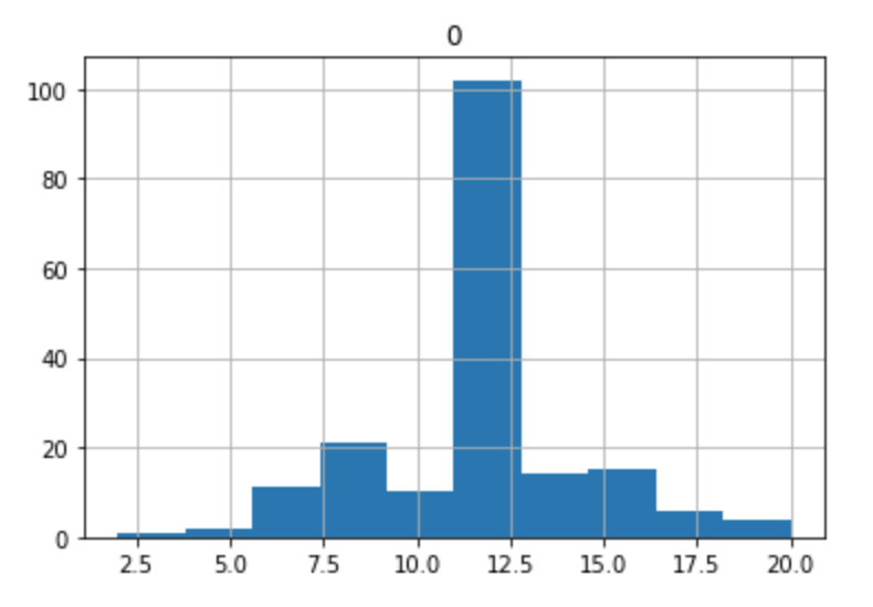
Keep in mind that the 10th / 11th buckets are our "neutral" polarity, so those x-axis labels should be adjusted accordingly.
Next Steps
In our visualization, we see what is probably a rough bell curve.
It's likely that most sets of tweets, when visualized like this, will begin to form a bell curve, with the tails representing the extremely polarized tweets and the peak representing neutral opinions.
In the next part of this series, we'll explore kurtosis and what it means for a set of tweets.